|
    
 |
Color
chart development, coloring and
lights tests
The
idea was to acheive the look of
old magazines, more precisely -
a printing technique that was capable
of acheiving richfull images by
combining only 2 colors. Apart from
that, after first color and lighting
tests with most sets, I've realized
immediately, on the first set, in
the very first days of shooting,
I'll be needing some sort of comparison
chart for shots to come. Some visualisation
of the way shots stick together.
To be honest, I've been pretty concerned
how would all this going to fit.
Why so? The thing is - ANIMATIC
is a double-bladed beast: it's simplicity,
so essential in early stages of
assembling the film, and crucial
for conveying character's movments,
pays it's toll in another department.
Backgrounds. And backgrounds means
sets. It's not like I haven't prepared
sets in 3D for ANIMATIC, I did.
3D sets were simple, as they should
be, but this can be misleading in
some occasions. In close-ups particulary,
where digital background can be
reduced to two-tone flat surface
and thus reveals almost nothing
about environment. 3D clips, edited
together worked fine in ANIMATIC,
but suddenly made no sense as guidelines
for final film. Nevertheless, that's
acceptable. Bigger problem that
emerged from simplicity of 3D sets
is an ommision of mine, really,
something that's hard to spot in
computer generated mock-up that
ANIMATIC is. To cut expenses and
time of production, I planned to
use some old puppets and models
of houses from my previous film,
SOLDAT. It's not so unheard of,
and particulary not so having in
mind that I intended from the start,
designwise, to pick up where I left
in Soldat, in pretty much the same
maneer. But, the ARCTIC PIRATE has
different story, with different
mood and goals. Sets in SOLDAT were
quite realistic, and puppets weren't
far from that, either. Just sligtly
naive and crude, to fit the techniques
applied, and the "B - movie"
premise. But here, on the other
hand, in the "Santa Clause
story", I needed some magic!
Some distorted realities, a little
bit more unrealistic puppets, characters
with more visual appeal. I made
some distorted, bulged sets. Oversized
elements on them. And then, just
in time to put it in the ANIMATIC,
inspired by real person I've passed
by on the street, I have redesigned,
or - finally designed, my protagonist:
Santa Claus got new shape! That
"new look" neccesitated
other elements to follow the same
design pattern - and some, already
built sets became unfit for that
approach. Becoming aware of this,
I did what I could to minimize that
differences in style, but it wasn't
always possible. Hence this shot
- charts, for comparing the visuals.
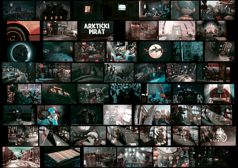
Final images chart is on the
top with as much balanced results
as possible. Here below, is a first
such chart, comprised from test
shots, and the few finalized shots,
in ratio 2 :1.
|
|
|
|
Early
visuals: other than for the Orphanage
exterior shots, this chart was composed
mainly of test shots, with the addition
of merely two Orphanage interior shots.
Many things were yet unclear, back
then. Also, colors weren't all corrected.
|
|
 |
|
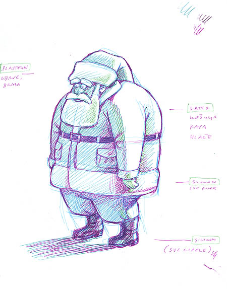
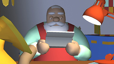
Santa's
changed look
|
 |
|
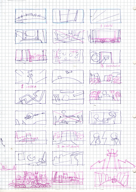
Concept
chart, forms and composition
|
 |
|
Early
Santa's look in 3D
|
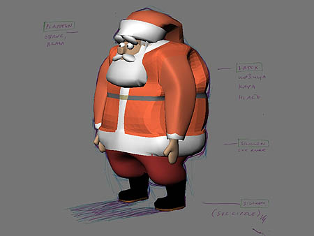
Santa's
changed look in 3D
|
 |
 |
|
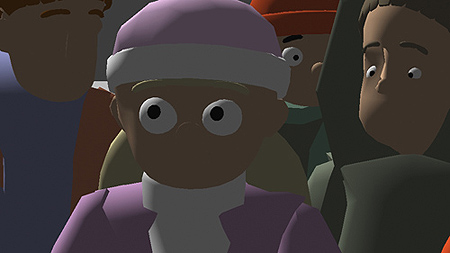
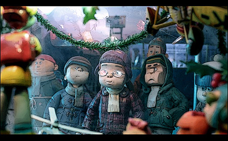
Early
Animatic characters
|
Final
characters
|
 |
|
|
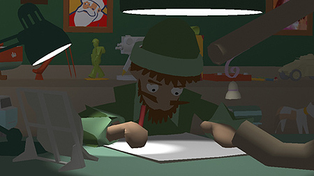
Early
Elf design
|
Mid-concept
Elf design(s) survived to the end
|
 |
 |
|
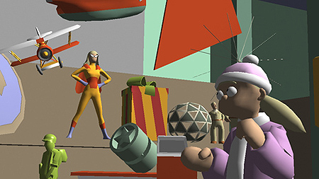
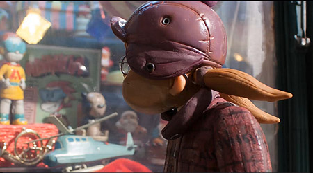
In
some cases, development in design
is not so appearent...
|
 |
 |
|
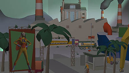
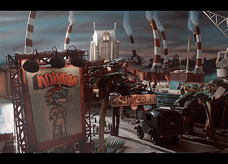
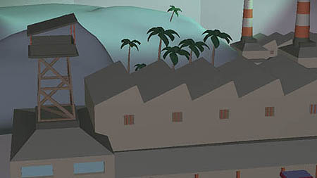
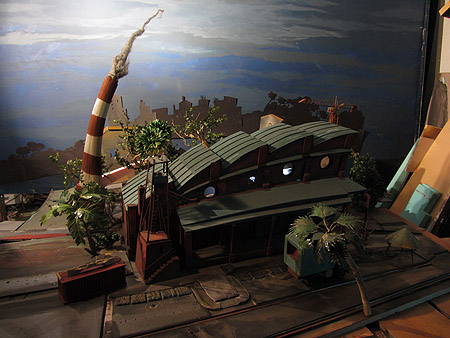
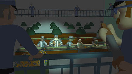
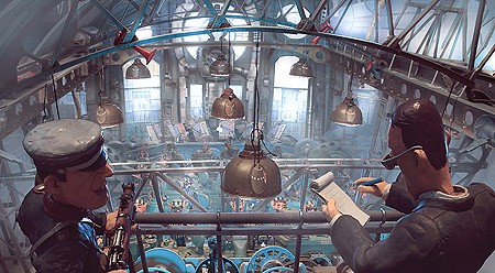
...but
there's a big change in some of them...
|
 |
 |
| |
 |
 |
|
This
one, too. Especially this one.
|
 |
 |
|
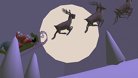
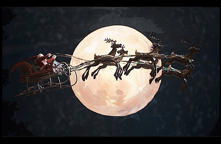
Now,
concept is maybe the same, but designwise
- sleds, raindeers, and Santa himself
- there's a big change
|
    
|